This project combines my economics and data science majors and looks at the relationship between credit scores and interest rates across the United States. It starts with a map of interest rate variations then uses various forms of regression models to predict and quantify the relationship between credit and interest rates. The dataset used for this project is United States loan data spanning from August 2007 to September 2015.
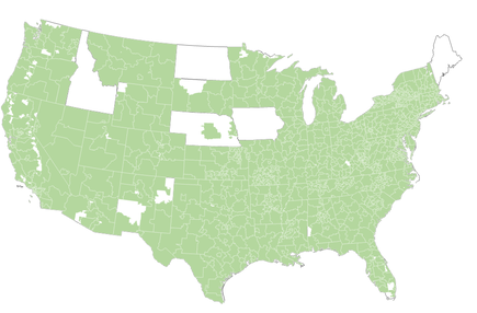
Before looking at the loan data, I have standardized the data by running a query using the Select by Attribute tool to find zip code areas that had 30 or more loans issued to ensure the data is accurately representing the area. The below map shows the ZIP3 areas with 30 or more issued loans that will be used during analysis.
Before looking at the loan data, I have standardized the data by running a query using the Select by Attribute tool to find zip code areas that had 30 or more loans issued to ensure the data is accurately representing the area. The below map shows the ZIP3 areas with 30 or more issued loans that will be used during analysis.
The first step of this analysis is a hot spot map as shown below created using the Hot Spot Analysis tool. This map shows statistically significant clusters of high and low interest rates across the United States. Alabama has a concentration of high interest rates, while there are concentrations of low interest rates, or cold spots, in the Northeast and California. The geographic unit in this study are ZIP3 areas, which take the first three digits of a standard 5-digit zip code.
Each loan is assigned a loan grade which indicates how risky the loan is. This hot spot in interest rates in Alabama makes me wonder if these higher interest rates are due to riskier loan grades. My next step is to run a regression model to determine if there is a relationship between loan grade and interest rates.
Each loan is assigned a loan grade which indicates how risky the loan is. This hot spot in interest rates in Alabama makes me wonder if these higher interest rates are due to riskier loan grades. My next step is to run a regression model to determine if there is a relationship between loan grade and interest rates.
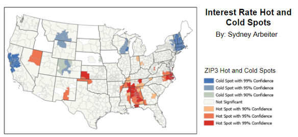
Each loan is assigned a loan grade which indicates how risky the loan is. This hot spot in interest rates in Alabama makes me wonder if these higher interest rates are due to riskier loan grades. My next step is to run a regression model to determine if there is a relationship between loan grade and interest rates.
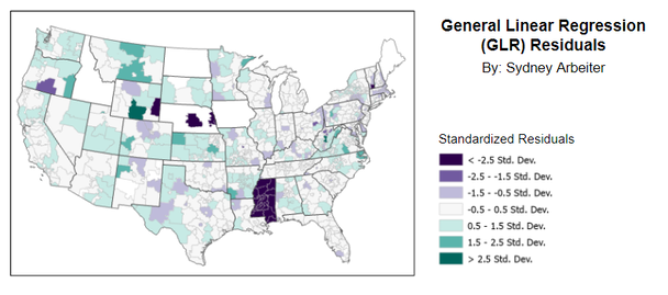
Using the Generalized Regression Model (GLR) from the statistics toolbox, I created a model to see if the relationship between these two variables is strong enough that loan grades can predict average interest rates accurately. The model used in this study is an ordinary least squares regression model that minimizes the sum of the squared differences between observed and predicted values. The below graph shows the residuals by ZIP3 area, which is the difference between expected and observed values that are used in the regression model. This model seems like a reasonably accurate predictor, with the exception of Mississippi.
Using the Generalized Regression Model (GLR) from the statistics toolbox, I created a model to see if the relationship between these two variables is strong enough that loan grades can predict average interest rates accurately. The model used in this study is an ordinary least squares regression model that minimizes the sum of the squared differences between observed and predicted values. The below graph shows the residuals by ZIP3 area, which is the difference between expected and observed values that are used in the regression model. This model seems like a reasonably accurate predictor, with the exception of Mississippi.
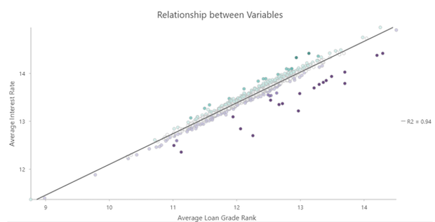
The R-squared value for this regression model is 0.942. This high value means that 94% of the variation in average interest rate can be explained by average loan grade. This R-squared value means there is a strong correlation between average interest rate and average loan grade, which is confirmed by this graph of the two variables.
The Generalized Linear Regression tool makes an assumption that the relationship between the two variables in the model is the same across all areas in the study, but after seeing that the model was not as accurate for Mississippi, the Geographically Weighted Regression may shed some additional light on relationships between average interest rate and average loan grade, especially in Mississippi. This tool generates a coefficient for each area in the study and shows the changes in the relationship by location. Now we will be able to see the ZIP3 areas in which average loan grade has a larger impact on average interest rate and where it has a smaller impact.
After running the Geographically Weighted Regression four times to identify which model had the best results, I found a model that had the lowest Akaike Information Criterion (AIC) and the highest R-squared value. The Akaike Information Criterion generates a value that represents the amount of information lost in the model, so lower values mean a better model. The adjusted R-squared value is 0.972, which is higher than the R-squared for the Generalized Linear Regression model.
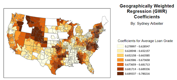
Now that I have identified the model that fits the best, it’s time to create a map that shows the coefficients generated by that model. The coefficients are the residuals of the model, just like the previous regression model, and they reflect the strength of the model. Larger coefficients mean a stronger relationship, and smaller coefficients reflect a weaker relationship between average loan grade and average interest rate. The below map shows the ZIP3 areas symbolized by coefficients and graduated colors. Darker areas have a stronger relationship between the two variables.
After running the Geographically Weighted Regression four times to identify which model had the best results, I found a model that had the lowest Akaike Information Criterion (AIC) and the highest R-squared value. The Akaike Information Criterion generates a value that represents the amount of information lost in the model, so lower values mean a better model. The adjusted R-squared value is 0.972, which is higher than the R-squared for the Generalized Linear Regression model.
Now that I have identified the model that fits the best, it’s time to create a map that shows the coefficients generated by that model. The coefficients are the residuals of the model, just like the previous regression model, and they reflect the strength of the model. Larger coefficients mean a stronger relationship, and smaller coefficients reflect a weaker relationship between average loan grade and average interest rate. The below map shows the ZIP3 areas symbolized by coefficients and graduated colors. Darker areas have a stronger relationship between the two variables.
There are a few conclusions to be drawn from this project. There is a very weak relationship between average loan grade and average interest rate in Mississippi, meaning that loan grades are not the only thing that determines the average interest rate of an area. Interest rates heavily influence people’s spending and borrowing, so it’s important to understand what influences interest rates and the strength of that impact in various locations across the country. It stands to reason that there are other factors besides loan grades that affect interest rates.
This project was based on a tutorial created by Esri in which we were tasked with providing the analysis of what each map was showing. This was a really exciting project for me, as it used data analysis and geospatial manipulation and visualization skills within an economics context. I really enjoyed pulling skills from both of my majors while working on this project. If you would like to try this tutorial yourself, you can find the instructions here: https://learn.arcgis.com/en/projects/determine-how-location-impacts-interest-rates/.
This project was based on a tutorial created by Esri in which we were tasked with providing the analysis of what each map was showing. This was a really exciting project for me, as it used data analysis and geospatial manipulation and visualization skills within an economics context. I really enjoyed pulling skills from both of my majors while working on this project. If you would like to try this tutorial yourself, you can find the instructions here: https://learn.arcgis.com/en/projects/determine-how-location-impacts-interest-rates/.
